Download our e-book of Introduction To Python
Related Blog
Matplotlib - Subplot2grid() FunctionDiscuss Microsoft Cognitive ToolkitMatplotlib - Working with ImagesMatplotlib - PyLab moduleMatplotlib - Working With TextMatplotlib - Setting Ticks and Tick LabelsCNTK - Creating First Neural NetworkMatplotlib - MultiplotsMatplotlib - Quiver PlotPython - Chunks and Chinks View More
Top Discussion
How can I write Python code to change a date string from "mm/dd/yy hh: mm" format to "YYYY-MM-DD HH: mm" format? Which sorting technique is used by sort() and sorted() functions of python? How to use Enum in python? Can you please help me with this error? I was just selecting some random columns from the diabetes dataset of sklearn. Decision tree is a classification algo...How can it be applied to load diabetes dataset which has DV continuous Objects in Python are mutable or immutable? How can unclassified data in a dataset be effectively managed when utilizing a decision tree-based classification model in Python? How to leave/exit/deactivate a Python virtualenvironment Join Discussion
Top Courses
Webinars
Python - Matplotlib

Rajesh Naik
2 years ago

Table of contents
- Introduction
- How to install matplotlib?
Using pip
Using conda
- How to import matplotlib module?
- Types of plots in Matplotlib
1. Sub Plots
2. Line plot
3. Histogram
4. Bar Chart
5. Scatter plot
6. Pie charts
7. Boxplot
- Summary
Introduction
Matplotlib is a Python library used to create 2D diagrams and graphs using Python scripts. It has a module called pyplot which simplifies plotting operations by providing functionality to control line styles, font properties, formatting axes, etc. It supports a wide variety of graphs and plots, i.e. histogram, bar graph, power spectra, error graph, etc. It is used in conjunction with NumPy to provide an environment which is an efficient open source alternative for MatLab. It can also be used with graphical toolkits such as PyQt and wxPython.
Using matplotlib we can plot line plots, scatter plots, histograms, bar charts, pie charts, box plots, and many more different plots. It also supports 3D plotting.
How to install matplotlib?
Using pip
python -m pip install -U pip
python -m pip install -U matplotlib
Using conda
conda install matplotlibHow to import matplotlib module?
We can import matplotlib module as follows:
from matplotlib import pyplot as pltTypes of plots in Matplotlib
- Sub Plots
- Line plot
- Histogram
- Bar Chart
- Scatter plot
- Pie charts
- Boxplot
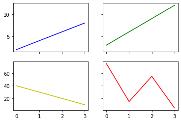
1. Sub Plots
If we want to display multiple plots in single figure then we use subplots() function.
Syntax:
#matplotlib.pyplot.subplots

matplotlib.pyplot.subplots(nrows=1,ncols=1,*,sharex=False,sharey=False,squeeze=True,
       subplot_kw=None,gridspec_kw=None,**fig_kw)
Example of Subplot
import matplotlib.pyplot as plt
import numpy as np

x  = np.array([0, 1, 2, 3])
y1 = np.array([2, 4, 6, 8])
y2 = np.array([3, 6, 9, 12])
y3 = np.array([40, 30, 20, 10])
y4 = np.array([75, 15, 55, 5])

# Create subplots
fig, ax = plt.subplots(2, 2, sharex='col', sharey='row')
ax[0][0].plot(x,y1,'b')
ax[0][1].plot(x,y2,'g')
ax[1][0].plot(x,y3,'y')
ax[1][1].plot(x,y4,'r')
Output
2. Line plot
Line charts are used to represent the relationship between X and Y axis.
Example:
import matplotlib.pyplot as plt
import numpy as np

x = np.array([2, 6])
y = np.array([0, 25])

plt.title("line plot")

plt.plot(x, y)
plt.show()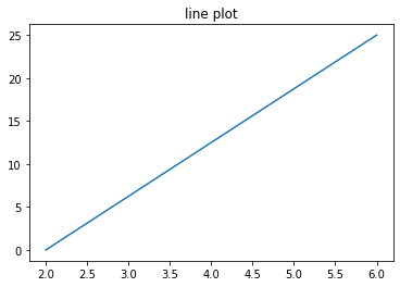
3. Histogram
The histograms are the bar charts, usually displayed with linked bars, where the values are separated into equal intervals, called bins or classes. The heights of the bars represent the number of records in this class, also known as frequency.
Syntax:
#matplotlib.pyplot.hist
matplotlib.pyplot.hist(x, bins=None, range=None, density=False, weights=None, cumulative=False,
 bottom=None, histtype='bar', align='mid', orientation='vertical', rwidth=None, log=False,
 color=None, label=None, stacked=False, *, data=None, **kwargs)
Example:
import matplotlib.pyplot as plt
import numpy as np

x = np.random.normal(70, 10, 200)
plt.hist(x, 15, density=True, facecolor='g', alpha=0.75)

#plt.hist(x)
plt.show()
Output

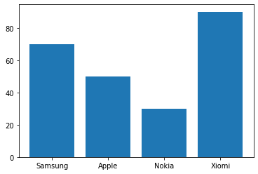
4. Bar Chart
Basically, the bar chart is used to show the relationship between numeric and categorical values. In a bar chart, we have one axis that represents a particular category of the columns and another axis that represents the values or counts of the particular category.
Syntax
#matplotlib.pyplot.bar
matplotlib.pyplot.bar(x, height, width=0.8, bottom=None, *, align='center', data=None, **kwargs)
Example
import matplotlib.pyplot as plt
import numpy as np

x = np.array(["Samsung", "Apple", "Nokia", "Xiomi"])
y = np.array([70, 50, 30, 90])

plt.bar(x,y)
plt.show()
Output
5. Scatter plot
The scatter plot is a graph of two sets of data along the two axes. It is used to visualize the relationship between the two variables. If the value along the Y axis appears to increase as the X axis increases (or decreases), this may indicate a positive (or negative) linear relationship. Whereas, if the dots are distributed at random with no obvious pattern, it could indicate a lack of a dependency relationship.
Syntax
#matplotlib.pyplot.scatter
matplotlib.pyplot.scatter(x, y, s=None, c=None, marker=None, cmap=None, norm=None,
 vmin=None, vmax=None, alpha=None, linewidths=None, *, edgecolors=None,
 plotnonfinite=False, data=None, **kwargs)
Example
import matplotlib.pyplot as plt
import numpy as np

N = 50
x = np.random.rand(N)
y = np.random.rand(N)
colors = np.random.rand(N)
area = (30 * np.random.rand(N))**2

plt.scatter(x, y, s=area, c=colors, alpha=0.5)
plt.show()
Output

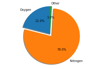
6. Pie charts
Pie charts are used to present categorical data in a format that highlights how each data point contributes to a whole i.e. 100%. The graph has a circular shape like a pie and each data point is represented by a certain percentage while taking part of the slice shaped sector. The larger its slice in the sector, the greater the proportion of the sector that the data point owns.
Syntax
#matplotlib.axes.Axes.pie
Axes.pie(x, explode=None, labels=None, colors=None, autopct=None, pctdistance=0.6,
 shadow=False, labeldistance=1.1, startangle=0, radius=1, counterclock=True,
 wedgeprops=None, textprops=None, center=(0, 0), frame=False, rotatelabels=False,
 *, normalize=True, data=None)
Example
import matplotlib.pyplot as plt

labels = 'Oxygen', 'Nitrogen', 'Other'
sizes = [21, 78, 1]
explode = (0, 0.1, 0)  # only "explode" the 2nd slice (i.e. 'Oxygen')

fig1, ax1 = plt.subplots()
ax1.pie(sizes, explode=explode, labels=labels, autopct='%1.1f%%',
        shadow=True, startangle=90)
ax1.axis('equal')  # Equal aspect ratio ensures that pie is drawn as a circle.

plt.show()
Output
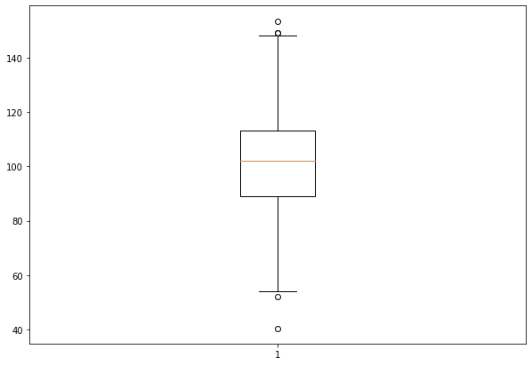
7. Boxplot
A boxplot is used to display the summary of the entire dataset or all numeric values in the dataset. The summary contains the minimum, the first quartile, the median, the third quartile and the maximum. In addition, the median is present between the first and third quartiles. Here, the x axis contains the data values and the y coordinates show the frequency distribution.
The Box Plot is also known as Whisker Plot.
Syntax
#matplotlib.pyplot.boxplot
matplotlib.pyplot.boxplot(x, notch=None, sym=None, vert=None, whis=None, positions=None,
 widths=None, patch_artist=None, bootstrap=None, usermedians=None, conf_intervals=None,
 meanline=None, showmeans=None, showcaps=None, showbox=None, showfliers=None, boxprops=None,
 labels=None, flierprops=None, medianprops=None, meanprops=None, capprops=None,
 whiskerprops=None, manage_ticks=True, autorange=False, zorder=None, *, data=None)
Example
import matplotlib.pyplot as plt
import numpy as np


# Creating dataset
np.random.seed(10)
data = np.random.normal(100, 20, 400)

fig = plt.figure(figsize =(10, 7))

# Creating plot
plt.boxplot(data)

# show plot
plt.show()
Output
Summary
Matplotlib is a Python library used to create 2D diagrams and graphs using Python scripts. It has a module called pyplot which simplifies plotting operations. It supports a wide variety of graphs and plots, i.e. histogram, bar graph, power spectra, error graph, etc. It is used in conjunction with NumPy to provide an environment which is an efficient open source alternative for MatLab. Using matplotlib we can plot line plots, scatter plots, bar charts, pie charts, box plots, and many more different plots.
Liked what you read? Then don’t break the spree. Visit our insideAIML blog page to read more awesome articles.
Or if you are into videos, then we have an amazing Youtube channel as well. Visit our InsideAIML Youtube Page to learn all about Artificial Intelligence, Deep Learning, Data Science and Machine Learning.
Keep Learning. Keep Growing.